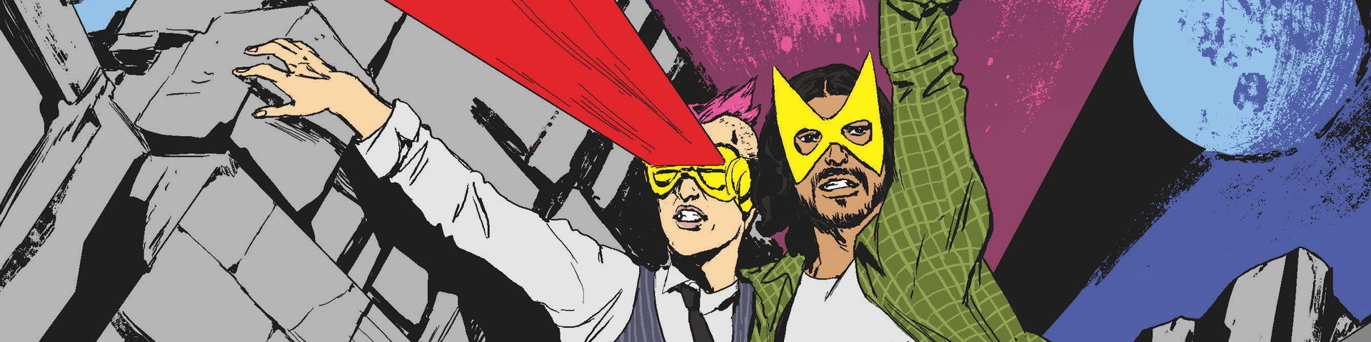

One last special feature before our final episode!
Friend of the podcast and friend of us Katie Moody made our logo twice over the years, based on the iconic comics logo, and we thought you might be interested to learn how.
Click the Continue Reading link, and we’ll turn it over to Katie for a deep dive into design!


On iconic wonkiness:
I’ve since learned that the logo used on X-Men #137, which this podcast’s logo was based on, was a 1969 riff on Jim Steranko’s original. Steranko’s 1968 version was even more wonky, as he made it quickly. For an excellent deconstruction, see Kate Willaert’s post “How the X-Men Logo Got Fixed.” (She also links to legendary letterer Todd Klein’s series on the X-logos, which includes his 1994 version.)
I can’t entirely agree with the “got fixed” framing, though. Objectively, sure… but for such bold letters to be slightly off somehow, you can’t help but stare at them more. Your brain tries to puzzle it out, and the flaws are what make it transfixing.
Ages ago I read something by Gail Simone on storytelling and mixing bitterness into sweetness. If memory serves—I can’t find the piece today—she explained that cheap perfumes are cloying because they’re all sweetness. The more expensive scents include a tiny hint of something nasty, and that is what commands your nose to pay attention. The most interesting stories aren’t all sweetness and light, and by extension, sometimes the best logos aren’t, strictly speaking, perfect.
(Also, with the advent of AI, evidence that something was crafted by actual human hands becomes more compelling by the day.)
To sum up:
This logo might be the most recognizable thing I’ve worked on outside of editing comics at Dark Horse (2003-2010). It’s been very cool to see versions of it appear on stickers, shirts, totes, and “cover art” illustrations over the past twelve years. (I particularly like the neon yellow version.) It’s gratifying to think it’s helped Jay and Miles reach more listeners and build an X-traordinary community.
This was AMAZING! I’m going to miss this show SO MUCH… and pats like this are a huge part of the reason why. Aesthetics, pedantry, wonkiness… all through the lens of the X-Men. Thanks for everything, Jay&Miles… and Katie!
Congrats to Jay and Miles! Job well done! What an excellent podcast! Thank you both for all of the hard work and dedication you both put into this podcast. It was a wonderful show to listen to and re-listen to.
Thank you for this, the creative process is always fascinating to see! 🙂
This was really cool!
It truly took a village to XPlain the X-Men…(now whether that village was ancient Romans or modern people who were mind controlled by Selene To think they were…)
Sweet! That’s really awesome to see happen. If you did it using AI it would probably be made of fingers 🙂 But that’s really awesome work and a great post!
This logo is awesome and is a part of what made me exited to listen all those years ago. Kudos!
This is so cool! Blow-by-blow process walkthroughs are always fascinating to me (look, if we weren’t nerds about this stuff we wouldn’t be here) and seeing all the different versions of the logo in different stages of completion makes a bunch of different elements pop out that I would’ve overlooked otherwise, like the way the letters have to taper a bit differently in every line. Thanks for taking the time to break this down for us weirdos in the peanut gallery.