Listen to the podcast here.

Art by David Wynne. Wanna buy the original? Drop him a line!

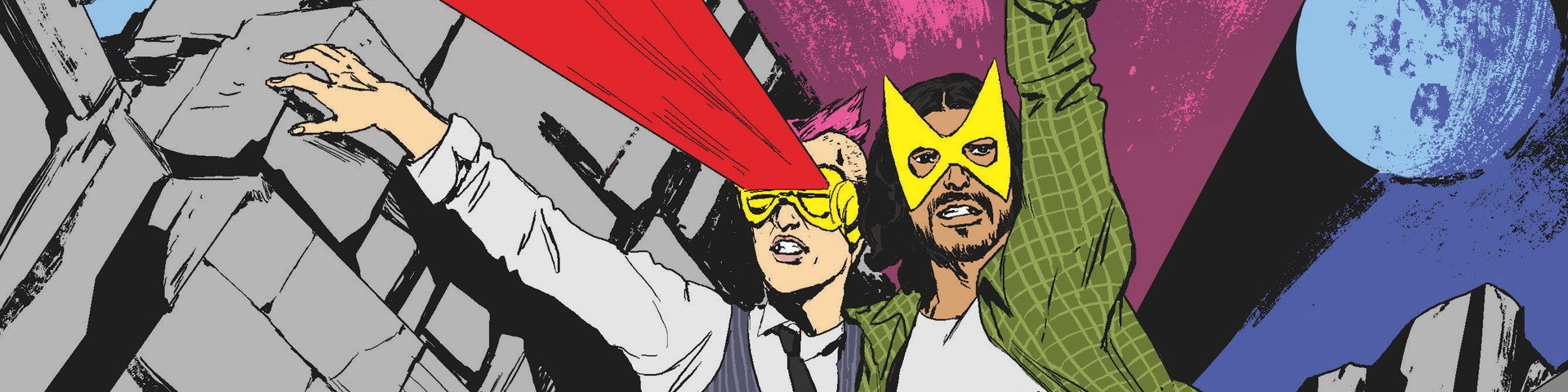
Aw, these kids. (Uncanny X-Men #208)

THEY’RE SO BAD AT BEING PEOPLE AND I LOVE THEM SO MUCH. (Uncanny X-Men #208)

I also love them. (Uncanny X-Men #208)

Really, this is one of those issues that just makes me want the X-Men to always be happy and never have to do any superhero stuff. (Uncanny X-Men #208)

Fucking hawks, always poaching passes on the gridiron. (Uncanny X-Men #208)

Jean “Grab fate by the throat and hold on until it stops moving” Grey. (Uncanny X-Men #208)

What do YOU think Jean is saying here? Fill in her word balloon for a chance to, I dunno, I guess we could publish a gallery of them? (Uncanny X-Men #208)

The second scariest face in this issue. (Uncanny X-Men #208)

NOPE NOPE NOPE NOPE NOPE NOPE NOPE NOPE (Uncanny X-Men #208)

Excellent use of ironic juxtaposition, there. (Uncanny X-Men #208)

It’s very text-heavy in Charles Xavier’s brain. (Uncanny X-Men #209)

“Now, let’s talk about my silvery mane.” (Uncanny X-Men #209)

I bet he wouldn’t be so depressed if he knew how good his depression beard looked! (Uncanny X-Men #209)

WHY DOES NOBODY IN THIS UNIVERSE HAVE APPROPRIATE PROFESSIONAL BOUNDARIES?! (Uncanny X-Men #209)

Version 1. (Uncanny X-Men #209)

Version 2. (Uncanny X-Men #209)

Ah, there it is. (Uncanny X-Men #209)

“Funny, I don’t remember that day being quite so caption-heavy.” (Uncanny X-Men #210)

“Later, we’re all going to go break into the zoo and flash the zebras. Trust us. It’s TRADITION.” (Uncanny X-Men #210)

Not a lot, Carl. Not a lot. (Uncanny X-Men #210)

“Look, Nathan, this is basically how we bond in my family.” (Uncanny X-Men #210)

He just hangs out in that position. (Uncanny X-Men #210)

“Let’s see. I went after a man in hospice care and got my ass kicked. What’s even lower-hanging fruit?” (Uncanny X-Men #210)

I can’t stop imagining them having to bat those captions out of the way as they run forward. (Uncanny X-Men #210)

He looks so mad about it! (Uncanny X-Men #210)

NEXT EPISODE: Obviously.
LINKS & FURTHER HEADLINES
I love John Romita Junior’s pencils on the X-men, both in the 80s and on this run. The problems that our hosts have rightly latched onto with women’s faces in these issues are indeed distracting and unfortunate. So while there’s no defense for the ugly faces in the finished artwork, the blame is – at most – only a third on JRJR. The inkers and colorist have to share in the responsibility.
The panels that look the worst, especially in #308, are inked by Al Vey who is working over JRJR’s pencils for the first time, here. Vey is a wonderful inker, and their partnership comes together better in future issues, but he goes way too heavy on the sunken cheek lines and the eyelashes – especially in that infamous panel of Jean. You’ll see heaviness in a lot of the most egregious panels. The Dan Green ones, less so.
The colors also contribute to the creepiness. Buccellato often exaggerates the prominence of those sunken cheeks with his colors. The fact that the shadows are often a light purple lends a slightly cadaverous feel to the skin tones, and almost doesn’t read as shadow, because it is so close to the value of the rest of the skin. Instances where the cheekbone lines are present without the colored shadows don’t look nearly as bad.
But the biggest coloring misstep is leaving the eyeballs paper-white. This makes them pop out unnervingly against the shadows.
I adore all of the artists involved, but each of their artistic ticks converge here to create those uncomfortable mannequin faces that really take a reader out of the story and Romita, unfortunately, has has taken most of the heat for it.
Is it just his accent or is Gambit talking about a much more fun holiday he and the cool X-Men celebration called “Danks-giving”